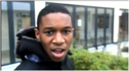
For evaluation three I and my partner decided that we would take a video of our peers and teachers and ask them specific questions that will enable us to get good feedback for our music video, Magazine advert and Digipak. By creating this video it will help us gain more detailed feedback for our three ancillary tasks both what’s good about them and what we could have done to improve. This would also allow us to use wire framing so we could back up the feedback with our video. This would helps us see what we could have improved if it was to be done again.
We chose that we would video our target audience. This was so we could get a better idea of what they thought and what they thought could have improved. These where people aged between 13-25. As most of our people were students we thought we would interview a teacher who wasn’t in our target audience bracket. This was so we could gain a range of feedback.
Our first question we asked was “what did you like about our music video”. The first male student answered with “i like how josh and harshiv were really into the music and I like the bit where josh clicked his fingers and then he disappeared. This worked well with the lyrics”. We are happy that he licked this bit as this was an effect we done on Final Cut. As we wanted the visuals to link the lyrics as this is one of Goodwin’s points, we thought of this idea and thought it would work well in our video.
Another student also said “i liked how josh was there then all of a sudden he went, this was really effective”. Once again another member said they really liked this effect. The next male said “i think the music video was very well done, and the performance was really well shot”. This was a good piece of feedback received as one issue we had was the shot selection. At first we kept using the same shots however we then found new ways to shoot the scene with just the main artist. We used a range of shots from close-ups to long shots. This was also said by a female aged 18. She said she liked how the shots were fast pace when the music was fast pace.
An improvement for our video was that we should include more of a narrative structure rather than having it all performance based. Also as we didn’t have enough footage to cover the whole song we had to cut some of the song of at the end. A young male said that it would have been better if you carried on for another minute as you can tell it has been cut off. Another young female said that we could improve it by changing the location, this I agree with as it would have looked more professional if it was in a studio.
Another question we asked our target audience was “what did you like about our digipak”. Most of the target audience liked the front cover of our digipak and also liked the sky theme we did. This was good feedback as i too liked the sky theme. One disadvantage said was that the font wasn’t very good. We struggled with choosing the right font for our digipak. As genre was R&B we tried looking for a font that reflected that but we could find any.
The final question we asked was “what did you like about our Magazine Advert”. Most of our target audience said that they liked it because it reflected our digipak and they also liked the picture we used. They said it looked professional and reflected the name “champion”. However a male aged 18 said he didn’t like the title as much. However other people said they liked the urban theme the title has.
I think the feedback received was very positive and detailed. This helped us identify what improvements we could have made with our music video. Overall I think we have made a god music video however if I was to re shoot the video I would defiantly use different locations.
Here is some feedback i received for my final video.yo can see that overall people thought the video was good but one not so good thing was the location used.
Shot 1- This is a shot that illustrates the link between the lyrics and visual. In this shot you can see the artist sitting on the bench where he is about to click his fingers. This shot shows the relationship between the lyrics and the visual as at that point he says “you never seen it”, at the same time you see him disappear when he clicks his fingers. He then re appears later on in the song. As the link between lyrics and visuals is common in most music videos we have included a few but this is the most obvious one.
Shot 2- This shot typifies the way a record company would want their artist to be represented as it shows the artist working on the mac screen and doing his job which is calling other people.
Shot 3- This shot demonstrates the genre of our music video as it shows a typical male expressing himself through his singing. Also you can see that the artist is wearing casual clothing with his changing hanging out. This is a typical look that is shown by most artists within the R&B genre. You can also see that he is wearing a hoodie with an earring. Also you can clearly tell that he is in a school toilet. This shows the artist acting as a teenager in school. Most artist relate to this as this genre is mostly aimed at teenagers.
Shot 4- This shot shows intertextual reference as it refers to the opening credits of films. As our first shot was too long we decided to make a beginning like a movie where the credits appear. This isn’t very common in most R&B music videos however there are some that have this theme.
Shot 5- This shot demonstrates the use of camera as it closely focuses on the artist. As we were high up we decided to use a mid shot so we could get the surrounding he was in. The view behind makes the artist stands out when he is singing. We also used a camera effect where the picture looks slightly blurred. This was used to make the video different. Some music videos have used this type of shot. The shot was still as it was a steady part in the song. However in the more upbeat parts of the song we decided to move the camera in different angles to give different effects.
Shot 6- This shot demonstrates the use of lighting in many ways. In this shot we wanted to closely focus on the artist. We did this by taken a close up and taking into consideration the sunlight in the background. You can see that his face looks darkened but this is because of the sunlight at the back. We thought it would create a good effect, looking at the feedback our target audience liked this shot.
Shot 7- This shot shows the use of mise-en-scene as our artist is seen in his casual urban style. You can see that his headphones are out; this is stereotypical as everyone has their headphones out. Also from the background you can see he is in a modernised area.
Shot 8- This shot shows that we have watched other music videos. I most R&B music videos you always see a shot of the artist signing in his mike in a recording both. These shots tend to me close-ups of the artist. Here you can see that there is a close up of the artist signing. An example of a video is “In Da Club”.
Shot 9- This shot shows that we have watched other music videos as it shows the main artist performing a short dance style move when singing his lyrics. Most R&B videos are performance based where the artist sings and dances at the same time. This shot also shows the link between visuals and music as the moves he is doing goes with the beat of the music.
Shot 1- This shot is taken from the video “Good Life” by Kanye west. This video was based mostly on effects not like other music videos. It has a carton theme, which is shown by the screen grab. This shot shows the link between the lyrics and the visuals as in that shot kanye west is saying exactly what appears on the screen, which is “I got to mine”. This is done throughout the music video soon introducing pictures as well as text. This is a key concept most music videos use.
Shot 2- This shot is taken from the video “outta control” by 50 Cent and Mobb Deep. This video is about how to enjoy life by parting. This video mainly focuses on having a good time with the girls. This shot typifies the way a record company would want their artist to be represented as it shows the relationship between 50 cent and his girlfriend. You can see by the close-up that 50 Cent has a slight smile on his face as he loves his girlfriend a lot. This shows that 50 Cent is a caring person and knows how to treat a girl.
Shot 3- This shot is taken for music video “All Of The Lights” by rihanna, kayne west and Kid Cudi. The music video is known to be of a R&B genre. This shot illustrates the R&B genre in many ways. In most music videos know voyeurism is a key concept. In most R&B genres you will always see some sort of women exposing her sexuality. This is said also by Goodwin as he says this helps make the viewer more interested. You can see from the shot that the women is wearing minimal clothing, this helps create her sexual appearance. The shot is mainly focused on the behind of her body.
Shot 4- this shot is taken from the music video “All Of The Lights”. This shot shows intertextual reference as it is very similar to the film “Home Alone”. You see that the girl is walking from somewhere through the cold roads. In the film Home Alone the little boy is walking home from the supermarket in the snow. The cuts shown in the beginning are also similar to the movie. You see a close up of a girl then you see a long shot of the surroundings and then you see the girl cross the road. This is shown in the same steps in Home Alone.
Shot 5- This show is again from the music video “All Of The Lights”. This shot demonstrates the use of camera as it is very similar to the shot we have used for our music video. This shot closely focuses just on the artist making him the centre of attention. At this shot you see kanye west performing, a high angle is used to show his importance. This is the same shot we have used when Chris Brown is performing one of his routines. The camera moves from a high angle as seen in the screen shot, to a close-up of the artist. This is the same concept we have used.
Shot 6- This shot is taken from the music video “All Of The Lights”. In this screen grab you can see that the lighting has been edited to help make the shot stand out and grab the viewer’s attention. You can see Kanye West is in a dark place, were he is positioned in a certain place so that the light can shine directly to one part of his face whilst he is performing. This effect is done by a green screen. We wanted to try to create this effect with our music video as most of our video was shot in the daytime; however we wanted a scene where it was dark. This couldn’t be done so we then experimented with the lighting on the programme Final Cut.
Shot 7- This shot is taken from the music video “All Of The Lights”. This shot demonstrated mise-en-scene as you can see that the lighting created once again makes the shot stand out. You can see from Kanye West’s clothing that he looks very casual with the gold chain and sunglasses. Clothing is a key concept in music videos, especially ones with an R&B genre.
Shot 8- This shot is taken from the music video “outta Control”. This is a shot example that is common in most other music videos. You always see some sort of reference to a “supercar” in an R&B style video. In the video “Goodlife” this concept is used but it is transformed into a carton picture.
Shot 9- This shot is taken from the music video “outta control”. This shot demonstrates the fact that we have watched other music videos as you can see the artist 50 Cent is in a club of some kind enjoying himself with the girls. This is common in most R&B videos where the artist has gone to a club to enjoy himself.
Goodwin analysis of my video
I have decided to use Goodwin’s points to analyse my music video. During the make-up of my music video I have taken Goodwin’s points into consideration i.e the link between the lyrics and visuals and how our R&B genre is conveyed.
Music Video demonstrates genre characteristics:
Throughout this music video there are various elements that demonstrate the music genre. This song is based around a R&B genre, which is clearly illustrated throughout the music video. The music video starts of slow and then gets faster. Here we crosscut our shots more, making the music link to the visuals. We have also got some aspects of performance in some areas of the video. This was mainly done when the beat started to get up tempo. This adds to the R&B genre as most music videos have some performance. I have also included some effect that I done on Final Cut. As most music videos have special effects such as a simple blur or fade, I decided to put a fade when the music got fast faster, this also added to the R&B genre.
Relationship between lyrics and visuals:
The lyrics and the visuals clearly have a relationship in our video as when “I got paper girl” Is said the performer takes out a piece of paper from his pocket. Also straight after when “the Lamborghini” is said the other artist pulls out a set of car keys demonstrating the Lamborghini. This allows the audience to closely focus on the video. Throughout the music video we constantly had the visuals syncing with the lyrics, some were less obvious then others.
Relationship between music and visuals:
There was a clear relationship between the music and the visuals. When the music got faster in between the choruses we had a few shots of the artist doing a few moves whilst singing. This went with the beat at the time and his moves were done accordingly. An example of this is when “ like like a bandit” was said the artist moved his chest right to left. This went with the music as it was fast and upbeat. Also when “with the spider seats” was said the artist did a hand gesture of a wheel signifying the car. This shows the relationship between the music and visuals.
The demands of the record label will include the need of lots of close up’s of the artist and the artist might develop motifs which recur across their work.
As this was a R&B music video we had included many close-ups from the start to the end. We did this to show the artists expression and how passionate he is with his music. The close-ups also allow the viewer to establish the artists more.
Reference to notion of looking:
The video closely focuses on certain areas of the body such as the face, lips and legs. This was done to emphasise the dancing skills that were done and the lyrics that where sung.
Vernallis Analysis on my Video
Editing- the editing has been done to match the pace of the song. This is demonstrated between 2:28-2:34. We have also included an effect whilst the camera cuts quickly in between the shots. The editing is foregrounded at 0:00-0:10.
Camera movement and framing- 0:10, 0:43, 2:04, 2:36 these are the timing where close-up shots are taken. 1:15- here an establishing shot is taken to see the surroundings of where the artist is. At 1:20-1:25 you see the camera moving from one singer to the other when different lyrics are sung.
Diegesis- characters may not move to the music- 0:38-0:39. Here the artist is standing still singing whilst the camera moves around him. At 0:40-0:46 it shows the artist in the same location which shows repletion.
Album Similarities
I have decided to compare our Album cover to Chris Browns album called Graffiti. You can see that the fonts between the two covers are very similar. As our song was of an R&B genre, we wanted a Graffiti style font that could be seen easily. Once looking at Chris browns album cover we gained some ideas to what we wanted the font to look like and the colour that would best suit the font. We placed the artist name at the top of the cover. This is the same with Chris browns and many other album covers we saw. As we didn’t have much space we could have both text “pretty Boi” and “Champion” the same size. So we decided we would put album name in smaller writing.
You can see that the clothing worn is very similar. As we wanted to go for the urban look, we thought it would be best for the artist to wear casual clothing like jeans and hoddie. This is similar to Chris browns clothing as he is also wearing jeans and a top. You can see that the colour of the font matches his clothing. We did this as well, as our title was black and white and the artist wasn’t wearing exactly black and white but it was very similar. The background for both covers a different. You can see the positioning of the artist is very different and Chris Brown is sitting down whilst ours is standing up. However, you can see that both artists are looking down. You can still see our artist but you can’t see Chris Browns face. As he is already famous people do not need to see his face. Ass our artist is a new R&B artist people needs to see his face.
This is a comparison of our album and Tinie Tempah album. You can see that the name of the artist over powers other writing as it is the most important. This is places right at the top of the album advert. This is similar to ours as we have also done this. The picture of the artist takes up most of the advert. A close-up is used for Tinie Tempah however we have used a low angle shot. We thought we would use a mid shot so you can see the artist’s personality. Another difference is that our album included where the album can be bought and downloaded. On Tinie Tempah, it does not say this it just says when the album will be out. The backgrounds between the two are very different. We went for the natural setting with the sky as the background however Tinie Tempah is just plain white. This may suggest that the songs in this album are not very upbeat.
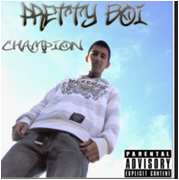
This is our final album Cover that we have created. As the album advert has to have something to catch the audience we thought we would use the same picture from our front cover of our digipak. When we received feedback everyone said the best picture was the front cover one. Also looking at other album adverts we noticed that most pictures are close-ups of the artist or an angled picture. We went with the same theme of the sky blue background as we wanted it to match our digipak. Also from the feedback most people liked how the sky is in the background, they said it brings out the genre.
We have also included a 5-star rating as seen on his jacket. This is to show how good the album is so users may buy it. When we looked at other albums we saw that most of them had this rating so we decided to put it in our one to make the cover look more professional. We have also included a Twitter and Facebook symbol to advertise the cover and show the artists webpage. We noticed that in other covers they just had the Facebook sign and then put a “/ad the artists name” in this case “/pretty boi”. We also included some feedback that we were given.
Bellow are print screens of the stages we went through and effects we used in order to create our final album cover.
This printscreen i have taken shows how i adjusted the brightness and contrast of the image to get the effect that i did. As the original picture was to light i decided to slightly increase the brightness. By changing the contrast the colours of the picture stand out making the picture come to life.
This is the cover we made before the final one. You can see that the writing was moved to near the artists head. As we couldn't think of another place to place it, it had to here. However it was slightly hard to read. From our feedback that we received our target audience said that they couldn't read the writing as it was slightly squashed. Also they said it rewind the picture. We then decided to move the writing on his jacket. this allowed more space for us and we could enlarge it slightly so it could be seen.
Also as this is a cover, another piece of feedback we got was that the ITunes and facebook sign was a bit to big. It looked funny and also rewind the picture as this would be the main focus.
Feedback given for Album Cover
-The album cover looks very professional. I like the picture you have used for the cover, it makes it look eye catching. I also like how you have the sky in the background. To improve i dont think you need the HMV logo as then you can see to many logos and also makes the picture look less eye-catching.
-
I like how you have done the sky effect it blends in with the picture nicely. I also like how the artist is looking down almost looks as if there is audience there. To improve i think you need to move the writing under “Out Now” as it looks to squashy
-
I like how you have increased the brightness of the picture. I also like the font you have used for his artists name. To improve try to work on the layout of the writing as it is looks very squashy.
Overall i think we have created a successful album cover. The effects we have done makes the poster look creative and professional. I think we gained good feedback as it helped us create the final product.
The record label we have chosen is Def Jam Records. We chose this record company as similar artist to ours are signed such as Rihanna and kanye West. Def jam records are seen to be related with an R&B genre.
Def Jam Recordsis an American record label, focused primarily on hip hop and urban music, owned by Universal Music Group. In the UK, the label takes on the name Def Jam UK and is operated through Mercury Music Group. Def Jam was created by Rick Rubin and its first release was a single by his punk-rock group Hose. Below are some of the videos signed up to Def Jam Records.
This is the original picture we took for our last panel of our digipak. As we didn’t have a close-up in any other panels we thought we should include at least one. Most album covers always consist of close-ups of the artist.
These images are normally placed on the front cover for their album however we thought it would work well on the inside as our other pictures where very good. This picture looks very natural which is what we wanted. It shows the artists facial expression. You can see he has a slight grin. Bellow is the steps we went through to get our final image.
picture of final photo-
This is the final version of the left panel of our digipak. We adjusted the picture by using the brightness tool. We thought the picture looked to dull and the colour were very bland. We then played around with the exposure and contrast to enable the colours to stand out almost creating a outline around the artist. We also changed the colour of the sky slightly making it look more blue like on the other pictures on the back panel.
picture of brightness/contrast and gradient
Picture before the final product
Feedback on left panel
-- I like the close up of the artist. The shot looks better form the side angle of him looking at something rather than just a plain close-up from the front. I also like the background where the artist is; it goes well with the R&B genre.To improve you could make the image stand out by making it brighter.
- - I like how you have taken the close-up of the artist. I also like the effects you have done with the picture. To improve you could the colour stand out more


 As this was a R&B music video we had included many close-ups from the start to the end. We did this to show the artists expression and how passionate he is with his music. The close-ups also allow the viewer to establish the artists more.
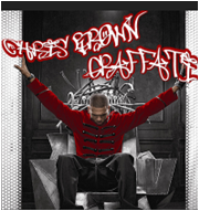
 I have decided to compare our Album cover to Chris Browns album called Graffiti. You can see that the fonts between the two covers are very similar. As our song was of an R&B genre, we wanted a Graffiti style font that could be seen easily. Once looking at Chris browns album cover we gained some ideas to what we wanted the font to look like and the colour that would best suit the font. We placed the artist name at the top of the cover. This is the same with Chris browns and many other album covers we saw. As we didn’t have much space we could have both text “pretty Boi” and “Champion” the same size. So we decided we would put album name in smaller writing.


