
 Here is Ed Sheeran’s album cover. You can see that that the cover is very bland with the colours used and the amount that’s going on. It’s just a simple close up of the artist. This shows that he may be a new singer or it maybe his first album. The different type of orange colour combinations overpowers the artist face; it’s almost like he is hidden which may show his personality.
 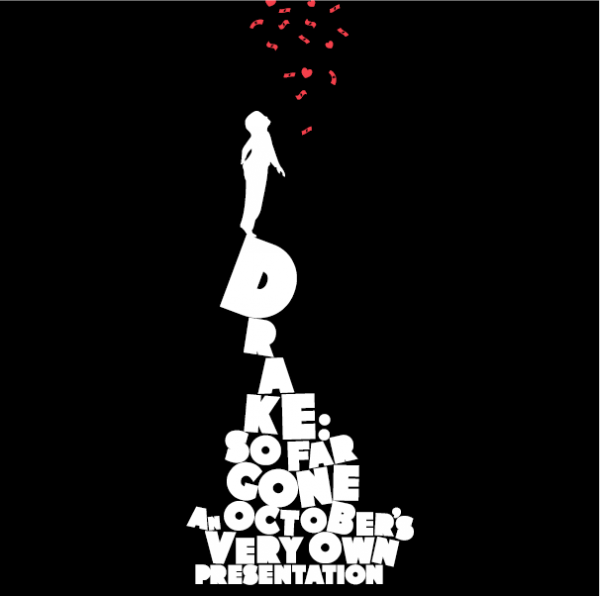 Here is Chris browns album cover called ‘graffiti’. You can see that the main focus is on the main artist Chris Brown. This is emphasised with the low angle shot used, which gives him a sense of authority. The album cover looks more like a carton, based on the colours and images used. The artist’s name isn’t as clear as it blends in with the background colours. The background picture looks like the earth, this may show the story hidden in the album as it may be about his own life as most of his wrapping is about what’s going on in his life.
 This is album cover by Drake. Most other album covers has a picture of some sort of the artist however this album cover is totally different as there is no picture of the main artist. Also the main album title isn’t in a straight line like normal album covers, this is a pyramid feature. This may show that before drake wasn’t as well known but when he started realising albums he soon got to the top hence a picture of a person standing at the top. Furthermore the colour used in this cover is a contrast of black and white, which may tell us how his like transformed.

Here is an album cover by usher. You can see the main focus of this cover is on the main artist. The facial expression on the artists face shows that this album may be about love or something upsetting as Usher looks very dull and hurt. You can also see a bit of the tattoo on his wrist which may give a meaning in the album.
No comments:
Post a Comment